Posts

Introduction to the Blog

Hey there, The Four Squared members are the second year TESL students and this website/blog is one of our assignment for the subject FCE3400 Educational Technology in which we have to develop a website with certain given criteria. This is our first time developing a website as a group and all of us are beginners and we don't have much experience in this particular matter. We do hope; however, that this website followed the requirements and hopefully we are on the right track. Do click on our posts to view more and have a nice day. Disclaimer, information provided doesn't belong to us. We would like to thank those who came up with the things we needed. lol

Visual Design in 500 words

Image
This information is taken from this  website   god bless you, owner Colors Color is a primary and powerful ingredient of visual design. Designers create a color palette for a user interface (UI) to support the intent of the interaction, and to bring the personality of the brand to the application. There should always be a rational reason for choosing a color and they are mixed according to the principles of color theory . Colors are selected to provide good contrast between text and background for legibility and accessibility, or because they have a semantic meaning. The color balance is the proportion in which the colors of a palette are used in relation to one another. This sets the overall tone of the UI and creates an inner sense of order. Typography Typography defines the font type, size, and style used for text elements in the UI. As text becomes a primary form of navigation  with less focus on graphical elements such as buttons, typography plays a more important

Tips For Making An Interesting Visual Design

Image
TIPS..TIPS..TIPS ..Its basically a paramount need in no matter what we do in life. They are small but useful piece of practical advice that can be beneficial depending on what we are going though at the time.Since here in this wonderful blog, we are talking about Visual Design or Graphic Design (if we want to get technical) then i would like to proudly present to you some of the useful tips that can help improve our designing capabilities. You can click here or maybe here for further information  ~_~ And since we love tips (pun intended) we also found an interesting video that might be helpful for you guys in visual design. Bask away shall we?

Common Mistakes in Visual Design

Image
In the art of visual design, there will be some common mistakes prone to be made every once in a while. Since we are only human and not some creepy robots. From the mightiest of professional designer to the newest and amateur designers, both are unable to escape from making any mistakes. (hey it kinda rhymes) heee. So here are some examples of common mistakes done by both professional designer and amateur designer. You could find the information by clicking the links provided below ~o~ Mistakes Designer Makes Mistakes Non-designer (still amateur) Makes Common Mistakes to Avoid And for further reinforcement, you could watch the video we found from YouTube.com and we hope it would help you to understand better because you're not in the mood to read haha

Characteristics in an Interesting Visual Design

The characteristics, or simply put the "traits", plays a significant role in dictating whether or not that particular design catches one's fancy or attention. In other words, they are the ingredient of visual art. Take one part color, a pinch of texture, and a whole lot of shape and the result will be some well designed graphic design. Recipes may vary, but all works of art and design contain a combination of the following characteristics: LINE: Lines, in graphic design, can be used for a wide range of purposes: stressing a word or phrase, connecting content, creating patterns and more. COLOUR: Colour is used to generate emotions, define importance, create visual interest and unify branding. TEXTURE: Texture relates to the surface of an object. Using texture in graphic design adds depth and visual interest. This can be applied graphically in the form of pattern or through the choice of printable surface. SIZE: In graphic design, size is used to convey im

Elements and Principles of Visual Design

Image
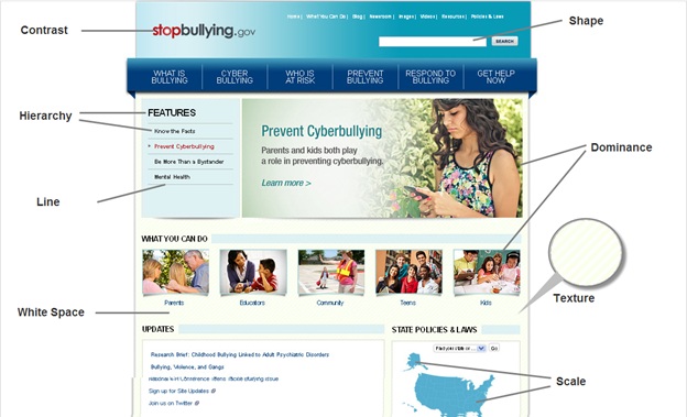
Living up to the name, visual design focuses on the aesthetics of a site and its related materials by strategically implementing images, colors, fonts, and other important elements. A successful visual design does not take away from the content on the page or function.  Instead, it enhances it by engaging users and helping to build trust and interest in the brand. On the other hand, a successful visual design applies certain principles to elements as described above and effectively brings them together in a way that makes sense. Information regarding the basic elements and the principlesof visual design could be found here This is the example of a website which features some of the principles in action. The explanation could be found in the same given website.

Importance of Visual Design

Image
Graphic design is an important tool that enhances how you communicate with other people. It serves to convey your ideas in a way that is not only effective, but also beautiful. There are a few factors to consider before investing  in graphic design services. Those factors can be found and explained through and through in the links provided below. Knock yourself out ^_^ Link 1 Link 2 Go ahead and take a look at it ;) Or maybe you could opt to watch a video on the Importance of Visual Design